What Color Grout for Gray Tile?
- Sinotiles
- 2026-03-30
Choosing the wrong grout can ruin a beautiful gray tile. Many people feel stuck and worry about making a costly mistake that affects the whole space.
The best grout color for gray tile depends on your design goal. Light grout creates a soft, seamless look. Dark grout adds contrast and highlights patterns. Neutral tones offer balance and flexibility for most spaces.
Gray tile is popular because it works in many styles. Still, grout is what ties everything together. The right choice can make your tile look high-end or completely off. So it is worth taking a closer look.
Which grout colors match gray tile best?
Many people struggle to match grout with gray tile. The wrong tone can look too harsh or too dull, and that can break the whole design.
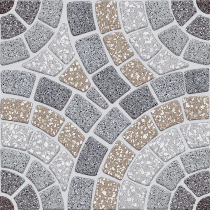
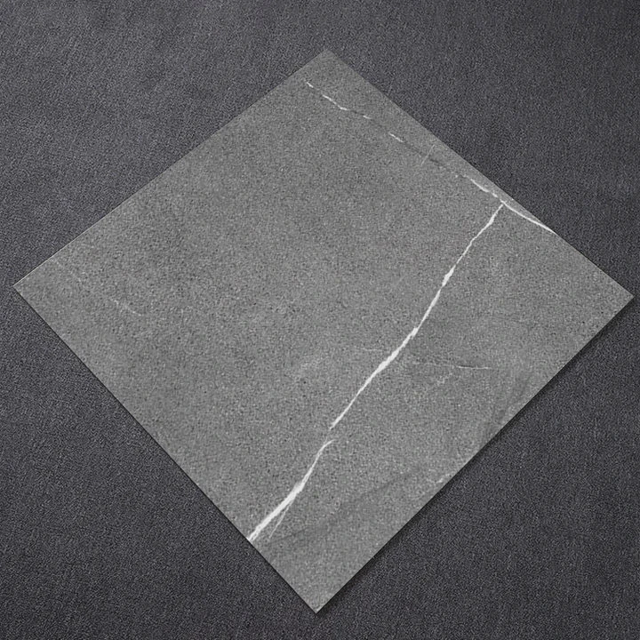
The best grout colors for gray tile are white, light gray, dark gray, and charcoal. Each creates a different visual effect, from clean and seamless to bold and defined.
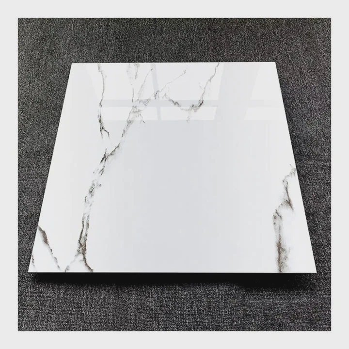
Gray tile is flexible, but that does not mean every grout works well. The key is understanding how each option changes the final look.
Common grout color options
Here are the most popular grout choices and what they do:
| Grout Color | Visual Effect | Best Use |
|---|---|---|
| White | Bright, clean contrast | Bathrooms, modern kitchens |
| Light Gray | Soft and blended | Minimalist spaces |
| Medium Gray | Balanced and neutral | General use |
| Dark Gray / Charcoal | Strong contrast | Statement floors or walls |
White grout with gray tile
White grout creates a fresh and clean look. It highlights each tile clearly. This works well for subway tiles or small formats. But it can stain easily, so maintenance matters.
Gray-on-gray combinations
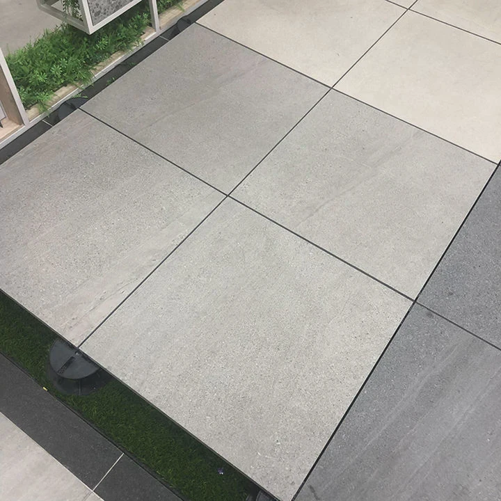
Using similar gray tones creates a seamless effect. The floor or wall looks larger and calmer. This is popular in modern and commercial designs.
Dark grout options
Dark grout like charcoal gives strong contrast. It outlines each tile and adds depth. This works well with geometric patterns or large format tiles.
How to choose the best match
When selecting grout, I often suggest starting with the tile tone:
- Light gray tile → use light gray or white grout
- Medium gray tile → use medium gray grout
- Dark gray tile → use charcoal or dark gray grout
This approach keeps the design balanced. It also reduces the risk of mismatch.
In real projects, many buyers prefer medium gray grout because it hides dirt better than white and is safer than very dark tones. This makes it a practical choice for both residential and commercial spaces.
How does grout color affect tile appearance?
Many people focus only on tile color and ignore grout. This is a mistake because grout changes how the tile looks as a whole.
Grout color affects contrast, space perception, and visual flow. Light grout softens the look, while dark grout creates definition and highlights tile patterns.
Grout is not just a filler. It is part of the design. It can change how big a room feels and how clean the layout looks.
Visual impact of grout color
Grout affects three key areas:
1. Contrast
- High contrast (dark grout + light tile) → bold and graphic
- Low contrast (similar tones) → soft and uniform
2. Perception of space
- Light grout → makes space feel larger
- Dark grout → can make space feel smaller but more detailed
3. Tile emphasis
- Matching grout → focuses on surface as a whole
- Contrasting grout → highlights each tile shape
Example comparison
| Tile + Grout Combo | Result |
|---|---|
| Light gray tile + white grout | Clean and airy |
| Light gray tile + dark grout | Strong grid effect |
| Dark gray tile + light grout | High contrast, dramatic |
| Dark gray tile + dark grout | Deep and continuous |
Real-world application
In many projects, I notice that customers change their mind after seeing grout samples. A tile that looks simple in a showroom can look completely different once grout is applied.
For example, large format gray tiles with matching grout create a luxury hotel feel. But the same tile with dark grout can look more industrial.
Why this matters
Grout color controls the final visual story:
- Do you want calm or bold?
- Do you want modern or classic?
- Do you want easy maintenance or high contrast?
These questions matter before making a decision.
Ignoring grout is like choosing a frame after painting a picture. It might still work, but it will not be perfect.
Can contrasting grout enhance tile design?
Some people avoid contrast because they think it is risky. But in many cases, contrast is what makes a design stand out.
Yes, contrasting grout can enhance tile design by emphasizing shapes, patterns, and layout. It adds depth and creates a more dynamic visual effect.
Contrast is not just decoration. It is a tool. When used correctly, it can turn simple tiles into a strong design feature.
When contrast works best
Contrasting grout is ideal in these cases:
1. Patterned layouts
Herringbone, chevron, and subway patterns benefit from contrast. The grout outlines each piece and makes the pattern clear.
2. Small tiles
Mosaic tiles or small formats look more detailed with contrast. Each tile becomes visible.
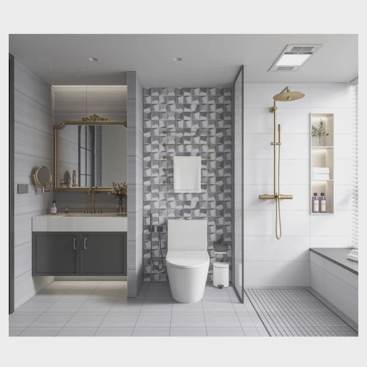
3. Feature walls
Accent walls need attention. Dark grout with gray tile can create a bold statement.
Design advantages
Here is what contrasting grout can do:
- Highlight craftsmanship
- Add texture and rhythm
- Create visual interest
- Make simple tiles look unique
Possible drawbacks
Contrast is powerful, but it has risks:
| Issue | Explanation |
|---|---|
| Too busy | Strong lines can feel overwhelming |
| Hard to match | Requires careful color pairing |
| Trend risk | Bold styles may go out of fashion |
How to use contrast correctly
To make contrast work, balance is key:
- Use it in one area, not everywhere
- Combine with simple furniture or surfaces
- Test samples under real lighting
In one project, a client chose dark grout with light gray subway tiles. At first, it looked too strong in samples. But after installation, it became the highlight of the kitchen. The contrast added character without extra cost.
So contrast is not something to avoid. It just needs careful planning.
What factors influence grout color choice?
Choosing grout is not only about color preference. Many practical factors affect the final decision.
Grout color choice depends on tile color, room function, maintenance needs, lighting, and overall design style. All these factors work together to determine the best option.
Many buyers focus only on appearance. But real projects require a balance between design and function.
Key factors to consider
1. Tile color and size
- Light tiles → more flexible grout options
- Dark tiles → better with darker grout
- Large tiles → usually need less contrast
- Small tiles → can benefit from contrast
2. Room type
Different spaces have different needs:
| Space | Recommended Grout |
|---|---|
| Bathroom | Mold-resistant, medium gray |
| Kitchen | Stain-resistant, darker tones |
| Living room | Flexible, design-focused |
| Commercial space | Durable, low-maintenance |
3. Maintenance
This is often overlooked:
- White grout → shows dirt easily
- Dark grout → hides stains better
- Medium gray → best balance
In many export projects, clients prefer medium gray because it reduces cleaning issues.
4. Lighting conditions
Lighting changes how grout looks:
- Natural light → shows true color
- Warm light → makes grout look warmer
- Cool light → makes grout look sharper
Always test grout in real lighting conditions.
5. Design style
Style also guides the decision:
- Modern → seamless gray grout
- Industrial → dark contrast grout
- Classic → soft neutral tones
Practical selection process
A simple way to decide:
- Identify tile tone
- Decide if you want contrast or not
- Consider maintenance needs
- Test 2–3 grout samples
- Check under real lighting
This process reduces risk and improves results.
From experience, skipping sample testing is the biggest mistake. Many colors look different after installation. A small test can save a lot of trouble.
Conclusion
Choosing grout for gray tile is about balance. Light tones create calm spaces, while dark tones add contrast. The best choice depends on design goals, usage, and maintenance needs. Careful selection makes the tile look complete and professional.